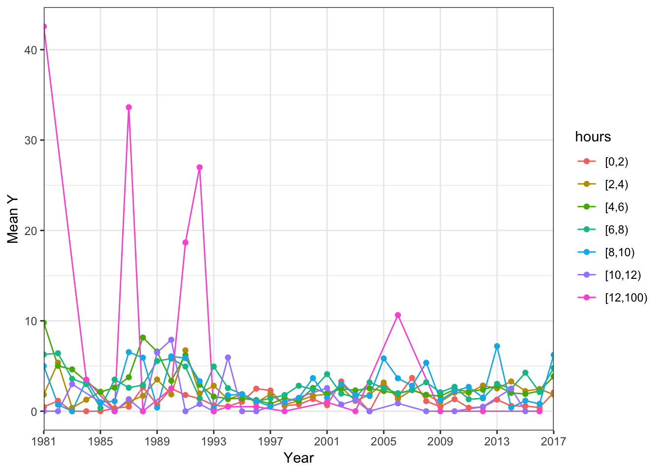
All I really wanted to do was use dplyr inside a function.
My goal was to make a function that could dynamically produce factor interaction plots using ggplot.Easy, right? Yeah, once I knew how to do it.
Here’s the background on interaction plots.
An interaction plot (for those unfamiliar) is used to show how the relationship between a categorical factor and a continuos response variable is dependent on the value (or level) of an additional categorical factor.
For example, this figure below (taken from here) plots the relationship between GPA (the response variable) and the type of tutor the student worked with (first categorical response variable) plotted for each level of the gender (second categorical variable).

The non-parallel lines indicate there is an interaction between tutor type and gender on the predicted GPA.
So, back to my issue.
I was evaluating a handful of categorical covariates on a continuous response variable; less than 10 variables but enough that, for the sake of tidiness, it was better to write a function to which I could pass a covariate and the function would return a nice interaction ggplot.
The data in question were from a U.S. fishery organization. The dataset contained information about fishing trips fishers had taken in the past few years; information included the total number of fish caught on the trip, the date (year, season) of the trip, how many people were on the trip, etc….
My goal was straightforward: produce a plot with year (first categorical variable) on the X and average_catch (response) on the Y by different categorical variables such as hours_spent_fishing or fishing_area.
“Ok, Liz, this should be pretty straightforward”, I thought
First, I wrote this function…
interaction_plot1 = function(df, var1, var2){

  df2 <- df %>% dplyr::group_by(var1, var2) %>% dplyr::summarize(average_annual_y = mean(y_var))

  ggplot(df2, aes(x=var1, y=average_annual_y, color=var2)) + geom_line(aes(group=var2)) + geom_point()

}
I would pass it a dataset, and two variables, var1 and var2. Then the function would use dplyr to group by var1 and var2 and summarize total catch (the response variable) for each level of var1 and var2. Next, this new dataframe would be passed into ggplot magic and I’d get a nice plot out of it. Right!?
`interaction_plot1(df, year, hours)`Wrong! It results in an error
Error in grouped_df_impl(data, unname(vars), drop) : Columnvar1is unknown
Then, I tried to add quotes around the variable names.
interaction_plot2 = function(dat, "var1", "var2"){

 dat2 <- dat %>% dplyr::group_by("var1", "var2") %>% dplyr::summarize(average_annual_y = mean(y_var))

  ggplot(dat2, aes(x="var1", y=average_annual_y, color="var2")) + geom_line(aes(group="var2")) + geom_point()

}
But still, no luck!
Quosures, the solution.
Finally, I took to the internet (my solution for everything).
A hop, skip, and a leap and I found myself on this page about programming with dplyr.
Highyl recommend you read this page; I will not do it justice and I’m not an expert on tidyeval… yet.
Turns out, dplyr functions use something called non-standard evaluation (NSE) which basically means that these functions don’t follow the normal R rules of evaluation. Instead, they capture the expression that you send into a statement like group_by() or summarize() and evaluate the expression in a custom fashion. Ok, still confused, I kept reading.
Towards the middle of the page I found the golden key that explained/solved my entire problem:
Writing a function is hard if you want one of the arguments to be a variable name (like x) or an expression (like x + y). That’s because dplyr automatically “quotes” those inputs, so they are not referentially transparent. Let’s start with a simple case: you want to vary the grouping variable for a data summarization.<
YES! This is exactly what I wanted to do!
I find out that dplyr functions quote their inputs - that’s that NSE thing I mentioned above. So, to make the function work, the input needs to be quoted so that the function knows it’s taking a bare variable name and NOT some pre-defined object in the global R environment.
Quoting the variable should be easy; just use " ".
WRONG. This makes a string, we don’t want a string.
What we want is to capture the expression the way dplyr functions do, ya know, in the non-standard way. For this, we need to know a little about quosures, which are special formulas returned by the quo() function.
Here’s an example…
quo(q1)## <quosure>
## expr: ^q1
## env: globalSee how it returns a formula? That little puppy is called a quosure.
Quosure, quosure, quosure. What a fun word to say.
This is the format that we want for our variable that get’s passed into the dplyr functions. We need to for it be a quoted, expression-like object.
But, there’s always a “but”.
Like me in seventh grade, quo() takes everything SO LITERAL. If we were to use it to modify the top part of the function like so..
interaction_plot = function(dat, var1, var2){

  var1 = quo(var1)
  var2 = qup(var2)

  ....
}
…the function would literally pass ^var1 and ^var2 to the second part of the function.
It wouldn’t be dynamic; it wouldn’t see what the user typed for each position and return that variable name as a quosure.
We need to level up with enquo().
As the documentation says, enquo()
uses some dark magic to look at the argument, see what the user typed, and return that value as a quosure.<
To finish this off two things need to be done:
- Modify the function with
enquo()
In the first part of the function enquo the incoming variables.
interaction_plot2 = function(dat, var1, var2){

  var1 = enquo(var1)
  var2 = enquo(var2)

  ....

}- Then, tell
group_by()to hang back and NOT quote the variable becauseenquo()has already done the heavy lifting.
Do this with !! in the second part of the function.
interaction_plot2 = function(dat, var1, var2){

  ....

  dat2 <- dat %>% dplyr::group_by( !!var1, !!var2) %>% dplyr::summarize(average_annual_y= mean(y_var))

  ggplot(dat2, aes(x=!!var1, y=average_annual_y, color= !!var2)) + geom_line(aes(group= !!var2)) +
    geom_point() +
    scale_x_discrete(name = "Year", expand =c(0,0), breaks=seq(1981, 2017, by =4))+
    theme_bw() + labs(y='Mean Y')


}
Final working solution.
With enquo() and !! we’ve gone from DRAB to FAB!

interaction_plot_final= function(dat, var1, var2){

  var1 = enquo(var1)
  var2 = enquo(var2)

  dat2 <- dat %>% dplyr::group_by( !!var1, !!var2) %>% dplyr::summarize(average_annual_y = mean(y_var))

  ggplot(dat2, aes(x=!!var1, y=average_annual_y, color= !!var2)) + geom_line(aes(group= !!var2)) +
    geom_point() +
    scale_x_discrete(name = "Year", expand =c(0,0), breaks=seq(1981, 2017, by =4))+
    theme_bw() + labs(y='Mean Y')


}
interaction_plot_final(df, year, hours)
To Summarize…
- You CAN use dplyr within functions. YAY!
- quosures will help you do so.
- There are many resources (other than this post) that can guide you.
I hope this post has been helpful!